


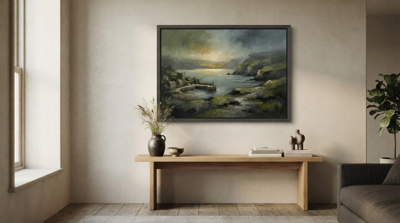
What if the feeling of a landscape has less to do with what it shows than with how it’s painted? Light, colour, edges and composition can make a familiar view feel peaceful, wistful or full of energy. That’s why atmospheric landscape paintings can be so appealing, yet surprisingly hard to judge from a screen.
If “atmospheric” seems subjective, you’re not alone. It can be difficult to separate the mood created by an artist’s technique from the subject itself, or to picture how a painting might feel in your home. A misty shoreline and a sunlit hillside may both have atmosphere, but suggest very different moods.
This guide will help you notice the visual choices that shape a painting’s feeling, describe the light, setting and mood you’re drawn to, and choose a work for its intended space. We’ll look at how style and subject work together, then consider how to assess a painting online with your room in mind. Start with what makes you want to look again.
Key Takeaways
- Look beyond the landscape’s subject to see how light, colour and composition shape its atmosphere.
- Use visual clues such as softened edges, deep shadows and strong contrasts to describe the mood you’re drawn to.
- Compare atmospheric landscape paintings by the feelings they suggest, rather than treating mood as a fixed rule of style.
- Picture a work in its intended room by considering wall space, natural light and the colours around it.
- Explore Brian Crosby Art’s original paintings and limited edition prints, including work informed by a specialism in architectural landscapes.
What makes atmospheric landscape paintings feel so evocative?
Atmosphere is the overall feeling created by a landscape’s visual elements. It can make a view feel hushed, unsettled, expansive or intimate before you’ve taken in every detail. In atmospheric landscape paintings, the subject matters, but it doesn’t determine the mood on its own. A coast might feel welcoming beneath a pale, open sky, or powerful and remote beneath heavy clouds.
In landscape painting, atmosphere is the feeling that emerges from the way light, colour, space and detail work together. These choices offer clues rather than prescribing one response. A muted palette might seem restful to one person and melancholy to another. Your memories and associations are part of the experience, too.
Look at how the scene is presented, not only what it depicts. Are distant forms clear or softened? Does the light reveal the whole view, or leave parts in shadow? A gradual loss of detail and contrast towards the horizon can suggest distance. This effect is known as Aerial perspective in art. It helps create a sense of air and space, even when the landscape is simplified.
Is atmosphere the same as realism?
No. A painting can communicate a convincing mood without describing every leaf, ripple or cloud with photographic precision. Literal detail tells you what is present; suggestion guides you towards what a place feels like. Softened edges, broad marks and selective detail invite the eye to complete parts of the scene, leaving room for imagination.
Notice what holds your attention. Perhaps a sharply defined tree stands against a hazy field, or a bright opening draws your eye through shadow. Those contrasts can feel more expressive than precise rendering alone. Realistic detail can be moving, too, but accuracy isn’t a condition for emotional impact. A painting may feel true to a remembered moment without recording every visible fact.
How subject and mood work together
Familiar settings make it easy to see how subject and mood interact. Open countryside might feel restful under clear morning light, yet stark beneath a low grey sky. Water can seem still and reflective, or restless when wind breaks its surface. A wooded path may invite you in, or feel secretive when the way ahead disappears into shade.
Time of day, weather and distance all shift the emotional tone. Evening light can warm a field while stretching shadows across it; mist can make a familiar shoreline feel remote. Even a wide, open view can seem lonely if a small building sits far away. Rather than assuming a subject is peaceful or uplifting, ask what the painting’s visual choices encourage you to feel.
Your response is personal, and it needn’t fit a single label. Describe what you notice first, then the feeling it brings: softened outlines and cool light might feel quiet to you, whilst another viewer sees something wistful. That’s a useful starting point for understanding why a landscape stays with you.
How light, colour and composition create atmosphere in landscape paintings
Atmosphere becomes easier to read when you look closely. Notice where the strongest light falls, how colours relate to one another and where the painter leads your eye. These choices work together: a bright opening can feel expansive when surrounded by shadow, while a compressed arrangement of dark shapes may make the same view feel enclosed. Visual choices shape the atmosphere a viewer perceives, guiding the eye and leaving room for personal response.
Light, weather and changing conditions
Mist, cloud, fading daylight and clear sun all affect how much of a scene is visible. Mist can blur boundaries; cloud may soften contrast or leave a few forms sharply lit; low light can draw attention to a remaining glimmer. None of these conditions carries one fixed emotion. Their effect depends on the balance of bright and dark areas, and on what surrounds them.
Follow the brightest area with your eyes. Does it lead you from a foreground detail towards the horizon, or hold you in one part of the scene? Look at the shadows, too. A dark passage beside a lit area can make the light appear more vivid and give the landscape a stronger sense of depth.
Colour, perspective and visual rhythm
Colour works through relationships, not isolated labels. A restrained palette may bring different parts of a view together, whilst a broader range can create contrast and liveliness. Warm and cool tones set against one another may help separate planes or suggest changing light, but no colour guarantees a particular mood. Notice how colours repeat, shift or sit beside each other.
Distance contributes to this effect. Distant forms often appear softer, paler or less distinct than nearby ones, with reduced contrast helping the eye read the space between them. Compare the edges and colours of a foreground shape with those nearer the horizon. Do they grow quieter as they recede, or does the painter keep them unusually crisp?
Composition and the path through a scene
Composition is the arrangement of shapes and open spaces. A close foreground can make you feel rooted in a place; a broad middle distance may carry your gaze onwards, while an unobstructed sky or stretch of water gives it room to rest. Paths, shorelines, ridges and bands of cloud can act like visual routes, leading the eye across or into the painting.
Consider where the painter places the largest shapes and where they leave breathing space. Balanced forms may create a settled impression, while an uneven arrangement can add movement or tension. These are possibilities, not rules. Ask whether your eye moves, pauses or feels held in one area, and how that movement contributes to the painting’s atmosphere.
Looking at original landscape paintings by Brian Crosby offers a chance to notice these choices at work in an artistic practice specialising in architectural landscapes. See which combinations of light, colour and space continue to draw your eye.
How to compare atmospheric landscape paintings by mood and style
Compare atmospheric landscape paintings by looking for visual clues rather than trying to find the “right” label. Start with your overall impression, then identify what contributes to it: the openness of the view, the strength of contrasts, the clarity of forms and the way the paint has been handled. Mood words are useful shorthand, but they’re prompts to look more closely, not rules every viewer must agree with.
What visual clues suggest different landscape moods?
Use the descriptions below as starting points. A single painting may suggest more than one mood, and your own response may differ from someone else’s.
| Possible mood | Visual clues to notice | Possible impression |
|---|---|---|
| Tranquil | Open horizon, spacious sky, gentle transitions | A sense of quiet or room to breathe |
| Dramatic | Strong light-dark contrasts, unsettled sky, forceful shapes | Energy, tension or change |
| Reflective | Muted colours, still water, subdued light | A pause for thought or a wistful quality |
| Mysterious | Obscured details, deep shadow, a partly hidden path | Uncertainty or a desire to look further |
These are possibilities, not fixed meanings. An open horizon can feel liberating or expose a scene’s emptiness; a dark sky may seem threatening, or simply full of movement. Ask what the painting makes you notice first, then whether the mood shifts as your eye travels through it. That change can be as revealing as your first impression.
How do painterly approaches change the feeling?
Some paintings describe forms carefully, giving trees, buildings or shorelines a clear presence. Others use looser marks and selective detail, allowing edges to dissolve or the viewer to imagine what lies beyond them. Neither approach is inherently better. Precision can invite close attention, whilst suggestion leaves space for memory and interpretation.
Visible brush or paint marks can bring texture and movement to a scene. Repeated strokes might echo wind across grass; broken marks can make water or foliage feel lively. In a more quietly handled work, smoother passages may keep attention on the broad arrangement of land, sky and light. Look at how these choices support the whole view, rather than judging a painting by one detailed or loosely painted area.
For a useful comparison, place two works side by side and describe each in a few words: perhaps “open, softly blended, still” and “enclosed, sharply contrasted, restless”. Then step back. Which composition holds your gaze? Which mood feels inviting, intriguing or meaningful to you? Trust your response alongside your observations. A label can help explain your preference, but it can’t decide it for you.

How to choose an atmospheric landscape painting for your space
Choosing a painting for your home is both a visual decision and a personal one. A work that catches your eye online may feel different beside your furniture or in the changing light of your room. Use this process to move from first impression to a considered choice, without losing sight of what drew you to the landscape.
- Identify the mood. Decide what you’d like the painting to bring to the room: a sense of openness, a moment of stillness, or a more dramatic focal point. You don’t need a perfect label. A few words about the feeling you want can help narrow your choices.
- Observe the palette. Notice the colours that hold your attention and how they sit alongside the room’s existing tones. Consider the wall colour, nearby furnishings and flooring. A painting doesn’t have to match them exactly, but its colours should feel at home in the space.
- Consider the setting. Think about the wall’s size, the furniture beneath it and the room’s natural and artificial light. If possible, view the artwork in different lighting conditions. Colour can appear warmer or cooler as the light changes, so assess it from the place where you’ll usually sit or stand.
- Compare formats. Consider the work’s dimensions and visual weight. A broad composition may suit a generous wall, whilst a smaller painting can feel more balanced in a compact area. Picture the artwork above nearby furniture, leaving enough space for it to be seen comfortably rather than crowded by its surroundings.
Match the painting’s mood to the room
Ask yourself what you want to feel as you enter or spend time in the room. A softly handled view might bring a gentle note to a reading corner, whilst a scene with strong contrasts could draw attention in a larger living space. These are starting points, not rules. Look at the painting from your usual viewing distance as well as close up, and see whether its mood still feels right from across the room.
Room light matters, too. Daylight changes through the day, while lamps bring their own warmth or coolness after dark. If you’re browsing online, use the image to judge the composition and mood, then consider how the palette relates to the colours and lighting where it will hang. For broader advice on selecting a unique work, explore this original paintings collector’s guide.
Think about originals, prints and presentation
An original painting is a unique work; a limited edition print is one of a set of printed reproductions. Both offer a way to live with an artist’s work, but you may be drawn to one format over the other. Consider the medium and presentation that feel most suited to your home and how you want to experience the piece day to day. For more context, read the limited edition fine art prints guide.
Browse Brian Crosby’s original paintings and limited edition prints to see which work feels at ease in your space.
Explore atmospheric landscape paintings by Brian Crosby
After considering how light, colour and composition affect a landscape’s mood, you can bring those observations to your art browsing. Brian Crosby Art offers original paintings and limited edition prints, with a practice specialising in architectural landscapes and portraits. As you explore the landscapes, look closely at how a sense of place is conveyed and which visual qualities you’re naturally drawn to.
A considered approach to landscape and place
Use your own words to describe what you see in Brian Crosby’s landscape paintings. Is the view open or enclosed? Does the light lead your eye towards a building, a stretch of sky or another part of the scene? Notice how the setting and its treatment work together, then ask what feeling the painting leaves with you. You might be drawn to a quiet palette, a particular arrangement of forms or the way a place is presented.
Brian Crosby is a recognised member of the Society of Architectural Illustrators. That connection offers context for a practice with an architectural landscape specialism, while your own response remains the best guide to what resonates with you. Look beyond the subject itself: consider the balance of detail and open space, and whether the work’s overall character feels right for you.
Choose a way to enjoy the artwork
An original painting is a unique work; a limited edition print offers another way to explore an artist’s imagery. They are distinct formats, so consider which feels more suited to how you want to live with the artwork. You may value the singular nature of an original, or prefer a print. Let your interest in the image and its mood lead, rather than assuming one format is automatically the better choice.
As you browse, keep your intended space in mind. Picture how the artwork might sit on your wall, what you’d notice from your usual viewing distance and whether its atmosphere would continue to appeal over time. Comparing your impressions across different works can help you recognise a pattern in the settings, colours or moods that hold your attention.
Explore Brian Crosby Art at your own pace, returning to the paintings that stay in your thoughts. View Brian Crosby Art’s original paintings and limited edition prints and see which landscapes speak to you.
Let the right landscape find its place
Choosing a painting doesn’t have to begin with certainty. Start with a detail that keeps drawing you back: a particular quality of light, a quiet stretch of colour or the sense of space within the view. As you browse, notice which pieces still feel compelling after a pause. That personal response can be a more useful guide than trying to match a room to a trend or choosing a mood because it seems expected.
Atmospheric landscape paintings can bring more than a view into your home. The work you choose may become a familiar point of focus, gathering new meaning as the light changes or as you notice something different in its composition. Give yourself room to explore, and trust what feels right to you.
Explore atmospheric landscape paintings by Brian Crosby and find a work that speaks to you.
Frequently Asked Questions
Are atmospheric landscape paintings always realistic?
No. Atmospheric landscape paintings can be realistic, loosely painted or highly simplified. A painter might use recognisable details to anchor a scene, then soften or leave out other elements to create a sense of haze, movement or distance. For example, a clearly painted building against an indistinct sky can feel more evocative than a fully detailed view. Judge the work by the response it creates, not by how closely it resembles a photograph.
Can an atmospheric landscape painting make a small room feel larger?
It can contribute to a greater sense of space, though it can’t change a room’s actual dimensions. A view with a visible horizon, receding path or broad stretch of water may draw the eye beyond the wall. In a narrow room, picture a landscape with a clear sense of depth rather than a dense arrangement of close-up forms. The painting’s dimensions and position still matter, so avoid letting it overwhelm the wall.
What should I look for when viewing a landscape painting online?
Check the full image and any close-up views, as these can reveal details that a small thumbnail hides. Read the artwork description for its dimensions and whether it’s an original painting or a print. Compare the image with your wall measurements, allowing for the space around the work. Screens can display colour differently, so treat the online image as a helpful guide rather than a perfect match for the artwork in person.
Is an atmospheric landscape painting a thoughtful gift?
Yes, especially if you choose with the recipient’s tastes and home in mind. Think about places they enjoy, colours they live with, or whether they prefer a lively scene to a quieter view. A landscape connected to a meaningful memory can make the gift feel personal without needing to explain the artwork on their behalf. If you’re unsure of their preferences, a print may be a considered alternative to choosing a unique original.
Do atmospheric landscape paintings need a frame?
Not always. Whether a work needs a frame depends on how it’s presented and the look you prefer. A frame can provide a visual boundary and help relate a painting to the room, whilst an unframed presentation may feel simpler. Check how the artwork is supplied and consider the wall, nearby furniture and surrounding finishes. If framing is needed, choose an option that complements the work without competing with it.
How can I tell whether a landscape artwork is an original or a print?
Start with the artwork’s written description, which should identify it as an original painting or a print. A print may have an edition number or signature, but these details alone don’t establish the work’s full history. For a purchase, keep the listing, receipt and any accompanying documentation together. If the information is unclear, pause before deciding and look for a description that states the format plainly.
How should I care for a landscape painting at home?
Keep the artwork away from strong direct sunlight, damp areas and sources of heat such as radiators or fireplaces. Dust the frame gently with a soft, dry cloth, taking care not to rub the painted surface or print. Avoid household cleaning sprays and water on the artwork. If you notice flaking, discolouration or other damage, don’t try to repair it yourself; seek advice from a qualified paintings conservator.