


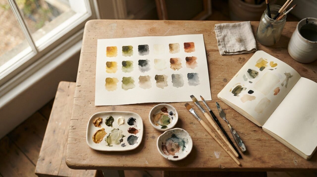
What if a muddy mix isn’t a mistake, but a useful clue? It can be frustrating when two promising colours turn dull on the palette, especially when colour theory feels abstract and every test seems to use up precious paint. These colour mixing exercises for beginners make the process calmer and clearer: small, repeatable tests show you how colours behave before you use them in a painting.
You don’t need a large collection of paints or hours of trial and error to get started. A few carefully chosen mixes can show you why colours change, how to adjust a result and what to look for in hue, lightness and intensity. Each test gives you something practical to observe, rather than a rule to memorise.
In this guide, you’ll try exercises with a limited palette, compare two-colour combinations and explore how to lighten, darken or soften a mix. You’ll learn to make more intentional colour choices and build a repeatable practice habit at your own pace. Confidence grows through looking closely, one small mix at a time.
Key Takeaways
- Use colour mixing exercises for beginners to see how paint combinations change. Start with equal amounts, then adjust the proportions.
- Compare warm and cool versions of a colour side by side, and observe how complementary colours affect a mix.
- Treat a muddy result as a clue. Check the pigments, proportions, repeated additions, and whether your brush or mixing surface is clean.
- Keep a colour journal of swatches and observations so you can understand what happened and repeat useful mixes.
- Build a simple routine: choose a pairing, test it and review your notes. Steady observation helps colour confidence grow.
Why beginner colour mixing exercises make painting less mysterious
An uncertain mix is a useful observation, not proof that you lack artistic ability. Paint can shift in surprising ways, and each result gives you information about the colours you chose. Colour mixing exercises for beginners are small, repeatable tests that show how paints behave together. Change one thing at a time and you can begin to spot patterns instead of guessing at the palette.
Swatches give each test room to show what happened. In a finished painting, a colour sits beside shapes, shadows and other colours, so it can be hard to tell which part of the mix created its effect. Separate samples make comparison easier. You can see whether a mixture looks warmer, lighter or less intense without working it into a whole picture.
Paint results depend on more than the colour name on the tube. Brand, medium and pigment all affect how a mixture looks and handles, so two paints labelled with similar colours may not produce identical results. Exploring colour theory offers helpful context, but your own swatches show how the materials in front of you behave.
What can a beginner learn from a colour mixing chart?
A colour mixing chart is a labelled record of paint combinations that lets you compare their appearance at a glance. Write the paint names beside each swatch, along with the proportions and any changes you made. This simple record helps you remember which mixture produced a particular result, even after the palette is clean.
As you compare samples, look at three features: hue, or the colour family; lightness, how pale or dark it appears; and intensity, how vivid or muted it looks. These observations turn a chart into more than a collection of squares. It becomes a practical reference for making deliberate colour choices later.
What materials are enough for a first mixing session?
Keep your first setup modest. Use a few paints you already have, a brush, suitable paper and water if it suits your medium. Use the same paper for each sample and similar amounts of paint, so it’s easier to tell whether a difference came from the colours or from your setup.
Acrylic and watercolour behave differently, so follow the handling that suits the paint you’re using. Watercolour is generally worked with water on paper; acrylic can also be thinned with water, but its feel and appearance differ. Keep your test conditions consistent within a session. Treat results from another medium or paint set as a fresh comparison. There’s no need to buy more materials before you begin.
Start with these two-colour exercises to understand paint relationships
Begin with three colours you already have: red, yellow and blue. For each test, use the same paper and similar amounts of paint. Mix equal parts first, spread a small swatch and note what you see. These colour mixing exercises for beginners aren’t about matching one “correct” result. Pigments and mediums vary, so your chart shows how your own paints behave.
Keep each test controlled: change the colour pairing or the proportion, but try not to change both at once. Label each swatch with the paint names and approximate amounts, such as “red + yellow, equal parts”. Once it’s dry, look at the sample in good light. Is its hue warmer or cooler than you expected? Does it look bright and clear, or more muted?
Exercise one: mix primary colours into secondary colours
Make three separate pairs: red with yellow, yellow with blue, and blue with red. Mix roughly equal parts of each pair, then paint a labelled swatch. You’ll see orange, green and violet combinations, though their exact appearance depends on the paints. Compare the results on your paper. Which looks warmer, cooler, brighter or more muted? Write one short observation beside each swatch.
Exercise two: change the proportions and compare colour bias
Choose one pairing and keep the paper, paints and brush the same. Beside your equal-parts swatch, try a mix with noticeably more of the first colour, then another with more of the second. Label each proportion approximately. A colour’s bias is its subtle lean towards another colour, which can influence the result even before you change the amounts.
The same named colour can mix differently across paints because pigments and mediums don’t behave identically. For example, two reds may shift a red-and-yellow mix in different directions. Observe rather than assume: note which sample looks more orange, duller or clearer, and tie your notes to the exact paints tested. The Art of Education University offers further colour-mixing activities to explore, particularly for watercolour.
These small tests build a practical feel for colour through patient observation. If you’d like guidance as you develop your painting skills, explore art lessons for beginners.
Compare warm, cool and complementary colours without guesswork
A colour can feel warmer or cooler depending on its lean and the colours beside it. To compare fairly, choose two versions of the same colour if you have them, such as a warmer blue and a cooler blue. Paint a swatch of each on the same paper and place them side by side under consistent lighting. First describe what you see, then consider which might suit a particular painting.
Use a small table to keep your observations together. Add the paint names and notes about the result. Your labels matter: colour names alone don’t tell the whole story, and different pigments can behave differently when mixed.
| Colour test | Swatch or paint name | Observation |
|---|---|---|
| Warmer version | ________________ | ________________ |
| Cooler version | ________________ | ________________ |
| Complement added | ________________ | ________________ |
How does a colour wheel help with mixing practice?
Think of the colour wheel as a visual map, not a formula that guarantees an exact paint result. Use it to find neighbouring colours for related mixes, or colours opposite one another for complementary tests. Choose one pairing, make swatches, then compare your painted colours with their positions on the wheel. If a result differs from what you expected, record the paint names and medium. Your materials are part of the evidence.
How can you test muted colours and earth tones?
Start with a colour you’ve already mixed and keep an untouched swatch beside it as a reference. Add a small amount of its complementary colour, mix and paint a new sample. Repeat with another small addition, making a separate swatch each time. This gradual approach helps you see when the colour becomes less vivid and how its hue shifts.
Earth tones can appear warm, subdued or close to the colours of soil and stone, but there’s no single recipe that works across every palette. Describe the actual result: perhaps it looks browner, greyer or more muted than the original. Separate that observation from judgement. A quieter colour may be useful for a shadow or background, even if it wasn’t the effect you expected. These colour mixing exercises for beginners build confidence by helping you notice what each combination does, one comparison at a time.

Troubleshoot muddy mixes with a simple colour journal
A dull or muddy mix isn’t a result you need to hide. Treat it as a clue. Several factors may contribute: the pigments, the proportions, repeated additions, or traces of another colour on your brush or mixing surface. Rather than changing everything at once, make a fresh, simple pairing beside the mix you’re investigating. Compare the swatches and look for what’s different.
Use this short checklist to guide your next test:
- Pigments: Which paints did you use? Record their names rather than relying on a general label such as “blue”.
- Proportions: Did one colour dominate, or were the amounts roughly equal?
- Repeated additions: Did you keep adding colours to adjust the mix? Each addition changes the combination.
- Brush and mixing surface: Could either have carried traces of another colour? Clean them before making a fresh comparison.
Choose one possible cause and change only that variable in your next swatch. For example, keep the paints and amounts the same, but clean the brush and mixing area. If the result changes, you’ve learned something useful. If it doesn’t, try a different proportion next. This steady approach makes each test easier to interpret.
Why do some paint mixes look dull or muddy?
There isn’t one universal cause. A mix may look less vivid after several colours have been combined, but the pigments and medium also influence the result. A brush or palette with leftover paint can introduce an unexpected colour, too. Compare the muddy swatch with a fresh mix made from just two paints. Note whether the fresh pairing looks clearer, warmer or simply different. This comparison helps you investigate without assuming the original result was a mistake.
How should beginners record and review their colour tests?
Keep a simple grid in a sketchbook, with one row for each swatch. Include the date, colour names, approximate proportions, medium and a short visual observation. For instance, write “blue + yellow, more yellow, watercolour; green appears muted”. Add one possible adjustment for the next test, such as using less of one paint. Dated entries let you revisit earlier experiments and notice how your eye and descriptions develop.
- Date: ____________________
- Colours and proportions: ____________________
- Medium: ____________________
- What I see: ____________________
- One change to test next: ____________________
Consistent notes turn trial and error into repeatable practice. Over time, your journal becomes a personal record of how your paints behave, not a set of rules you have to memorise. If you’d like support developing your observations through guided practice, explore art lessons for beginners.
Build a short colour mixing routine and keep practising
A little structure makes it easier to return to colour mixing without turning practice into a chore. Choose one pairing and one question to explore, such as “What changes if I use more yellow?” Make a few swatches, write down what you notice, then review them together. These colour mixing exercises for beginners are most useful when you can compare what you did with what you see.
Keep progress practical. You’re learning to make more informed choices, describe colour relationships and recognise how your paints respond. A perfect match isn’t the measure of success. If you repeat a test with a different medium or paint set, treat it as a separate comparison and note what you used. That makes it easier to see whether a difference comes from the materials or the mix.
What should a beginner practise first each week?
Give each session one focus. Try a straightforward two-colour mix, then explore how changing the proportions affects it in another session. Later, test one complementary pairing. Keep the swatches and notes together, then revisit a familiar pairing after more practice. Seeing it with fresh eyes can reveal details you missed before.
- Choose one question: Keep the test focused so the result is easier to interpret.
- Make and label swatches: Record the colours and approximate proportions.
- Write one observation: Describe the change you can see, without judging it as right or wrong.
- Save and review: Compare this test with an earlier chart or journal entry.
When might guided art lessons help with colour mixing?
Independent practice builds observation, and a teacher can help you notice relationships you may not yet see, then refine how you test and adjust a mix. Brian Crosby is a qualified art teacher offering lessons for beginners and improvers. If you’d value supportive, guided practice, explore Brian’s art lessons for beginners. Adult learners can also build their skills through guided art lessons.
Keep exploring colour, one mix at a time
Colour becomes less mysterious when you give yourself space to test it. Small, labelled swatches help you see how paint pairings and proportions change, while a simple journal turns surprising or muddy results into useful clues. With regular practice, you’ll make more informed choices without expecting every mix to be perfect.
The best colour mixing exercises for beginners are the ones that help you notice more: how a colour shifts, what your paints do together and which adjustments bring you closer to the effect you want. Return to familiar tests as your eye develops. Progress comes from observation, not natural talent.
If you’d like a teacher’s support as you build your skills, Brian Crosby is a qualified art teacher offering lessons for beginners and improvers. Explore friendly art lessons for beginners and continue your creative practice with calm, practical guidance.
Frequently Asked Questions
How do beginners start mixing paint colours?
Start with two paints and make a small, labelled swatch before using the mix in a painting. Try equal amounts first, then change the proportion of one colour while keeping the paper, medium and other paint consistent. Note what changes, such as whether the result looks warmer, lighter or less vivid. These colour mixing exercises for beginners are about observing your own paints, not finding one perfect result.
What colours should beginners mix first?
Try red with yellow, yellow with blue, and blue with red. These pairings give you a first look at orange, green and violet mixes. Begin with roughly equal amounts, label each sample with the paint names, then compare the results side by side. The exact colours depend on the pigments and medium, so describe what you see rather than expecting every red, yellow or blue to produce the same outcome.
Why do my paint colours look muddy when mixed?
A muddy-looking mix can have several causes, including the pigments used, the proportions or repeated additions of more colours. A brush or mixing surface carrying traces of another paint may also affect the result. Make a fresh swatch from a simple two-colour pairing and compare it with the mix that looks muddy. For the next test, change one thing at a time so you can see what makes a difference.
Can I practise colour mixing with only a few paints?
Yes. A few paints are enough to explore how pairings and proportions affect a mix. Start with colours you already have and test one pairing at a time, recording the names and approximate amounts. A smaller selection can make comparisons easier because you’re working with fewer variables. As you practise, you’ll build a useful record of how those particular paints behave, without needing to buy a larger set first.
How do I make a colour mixing chart?
Divide a sheet of suitable paper into spaces for separate swatches. Mix two paints for each sample, then label it with their names, approximate proportions and the medium you used. Leave room for a short observation, such as “darker than expected” or “more muted”. Keep the chart so you can compare hue, lightness and intensity across the samples. Use the same paper and similar amounts of paint for fairer comparisons.
Does colour mixing work differently in watercolour and acrylic paint?
Yes, the two mediums have different handling and can produce different-looking results. Watercolour is usually diluted with water and allows the paper to show through, while acrylic can be used in more opaque layers or thinned for a more transparent effect. The specific paint and pigment matter, too. Keep tests from each medium separate in your notes, and compare like with like rather than assuming a mix will behave identically.
What is colour bias in paint mixing?
Colour bias is a subtle lean towards another colour within a paint. For instance, one blue may appear to lean towards green, while another leans towards violet. That difference can influence the colour you get when mixing either blue with a second paint. Compare swatches made with the paints you own, and note their appearance and combinations. The label alone may not tell you how a particular pigment will mix.