


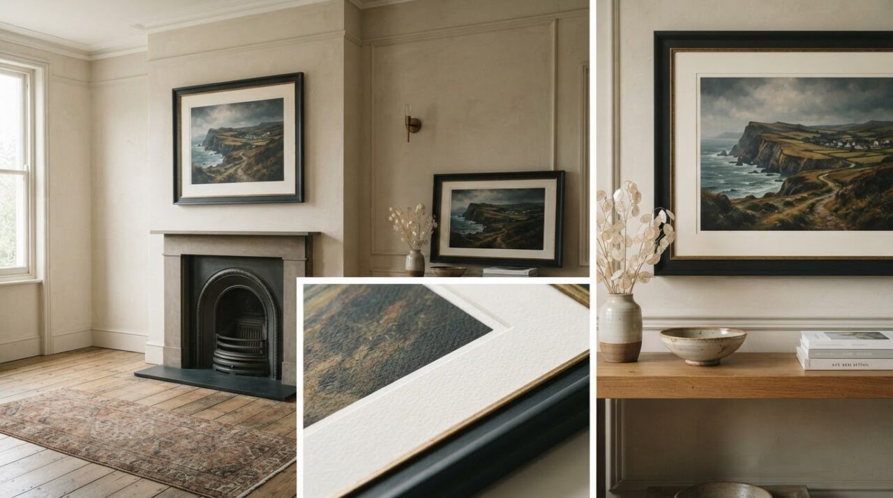
What if the finest-looking print isn’t the one with the most impressive-sounding label? A screen can make colour glow and fine detail seem effortless, but it can’t tell you how an artwork will feel on paper or look in your room. Choosing high quality art prints means looking beyond a product description and considering how the image, printing and materials work together.
If you’ve found it hard to compare paper types, judge a finish from a photograph or picture the right size on your wall, you’re not alone. This guide explains what shapes a print’s appearance and how to weigh your options. We’ll look at the artwork, printing, paper, finish and presentation, then consider how scale and framing affect a piece in a space. Brian Crosby’s limited edition prints offer an artist-led point of reference as you explore what makes a print one you’ll be glad to live with.
Key Takeaways
- Judge a print as a whole: the artwork, reproduction, materials and presentation all shape the finished piece.
- Look beyond labels such as “premium”. Compare practical details about the image, paper, size and presentation when assessing high quality art prints.
- Consider how paper surface, ink and colour reproduction affect a print’s look and feel, without treating technical terms as guarantees.
- Measure your wall, consider viewing distance and compare dimensions to find a scale that sits comfortably with the surrounding space.
- Explore artist-led prints by Brian Crosby and consider which subject and atmosphere you’d enjoy living with over time.
What makes high quality art prints feel like finished works of art?
Quality isn’t a single feature printed on a label. It comes from how the image, reproduction, materials and presentation work together. High quality art prints bring an artwork’s distinctive character to the surface through considered reproduction, suitable materials and a presentation that supports the image. That’s a useful way to think about quality without assuming every print needs the same paper, finish or production method.
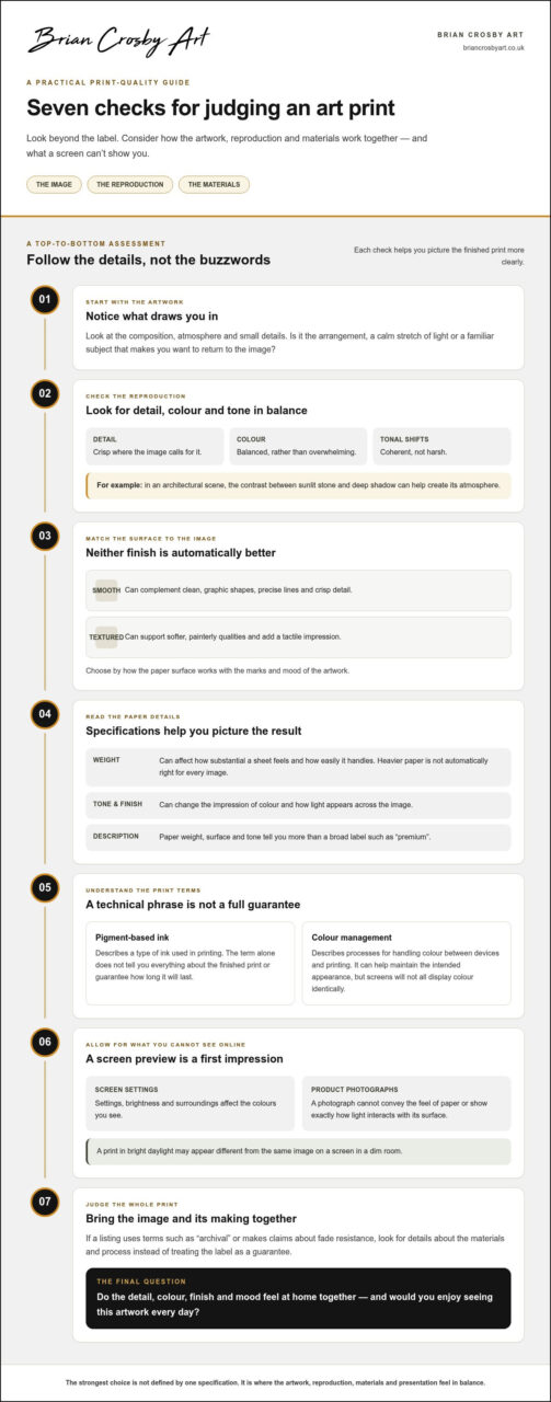
A compelling image can lose impact if its reproduction softens fine lines, shifts the balance of colour or flattens subtle changes in tone. Imagine an architectural scene where the contrast between sunlit stone and deep shadow creates its atmosphere. If those distinctions disappear, the print may feel less like the artwork the artist intended. Printmaking encompasses a range of methods and traditions; this overview of printmaking techniques and history offers context for the different ways images can be reproduced.
How can you recognise a well-made art print?
Start with what you can see. Look for crisp detail where the image calls for it, balanced colour and tonal transitions that feel coherent rather than harsh. The surface should suit the artwork. A smooth finish may complement clean, graphic shapes, whilst a more textured surface can support softer, painterly qualities. Neither is automatically better. The right choice depends on the image.
A screen preview is a useful first impression, not a perfect representation of the object. Display settings affect how bright or warm colours appear, and a photograph can’t convey the feel of paper or show exactly how light interacts with its surface. Consider the image as a whole rather than letting one specification decide for you. Do the detail, colour and finish feel at home together?
Why does the artwork itself matter as much as production?
Production can preserve an image’s qualities, but it can’t create an emotional connection that isn’t there for you. Composition guides the eye, atmosphere shapes the mood, and small visual details give a scene its particular character. A carefully made print may still not suit your taste or your room. Notice what draws you back to the image, whether it’s a striking arrangement, a calm stretch of light or a familiar subject.
Faithful reproduction keeps those defining qualities present in the finished print. Fine detail shouldn’t distract from the composition, and colour should support the image’s mood rather than overwhelm it. As you compare options, ask yourself: does the reproduction preserve what makes this artwork distinctive, and would I enjoy seeing it every day? Materials and production details matter, but they serve the artwork. The strongest choice is one where the image and its making feel in balance.
How paper, ink and colour reproduction shape an art print
Paper and ink aren’t just technical details. They influence how an image looks, how it feels to handle and how it sits in a frame. Paper gives a print its visual and tactile character, whilst ink and colour choices shape how faithfully the image comes through. The best combination depends on the artwork, so specifications are most useful when they explain what you can expect to see.
What should buyers know about art print paper?
Paper weight can affect how substantial a sheet feels and how easily it handles, but heavier paper isn’t automatically right for every image. Surface matters too. A smooth finish can suit precise lines and crisp detail; a textured one may add a tactile quality to a soft landscape or painterly scene. Consider whether the surface complements the marks and mood of the artwork.
Paper tone and finish can also change the impression of colour. A warmer-looking sheet may make pale colours feel softer, whilst a smoother or more reflective surface can affect how light appears across the image. Product descriptions that name a paper’s weight, surface or tone give you more to work with than a broad claim such as “premium”. These details help you picture the result without suggesting that one paper type is best for every print.
What do ink and colour accuracy tell you?
Pigment-based ink describes a type of ink used in printing; the term alone doesn’t tell you everything about the finished print or guarantee how long it will last. Similarly, colour management refers to processes for handling colour as an image moves between devices and printing. It can help maintain the intended appearance, but it can’t make every screen display colour identically.
Your screen’s settings, brightness and surroundings all affect what you see. A print viewed in bright daylight may appear different from the same image on a screen in a dim room. Clear product photographs and specific descriptions can help you understand the intended colour and surface. If a listing uses terms such as “archival” or makes claims about fade resistance, look for details about the materials and process rather than treating the label as a guarantee.
When comparing high quality art prints, connect the details to the image in front of you. A fine-lined architectural drawing may benefit from a surface that keeps its edges clear, whilst a scene with soft skies may rely on delicate colour transitions. Ask what each material or process contributes, not simply whether it sounds advanced. Brian Crosby’s artist-led limited edition prints let you consider how an artwork’s character carries through into a finished print.
How to compare high quality art prints without relying on vague claims
Product descriptions often use words such as “premium” or “museum quality”, but these don’t tell you exactly what you’ll receive. Start with details you can picture: which image is shown, what type of print is offered, its dimensions and how it will be presented. Listings vary in the information they provide, so compare the details available rather than assuming that one missing specification proves poor quality.
Which product details are useful when comparing prints?
Make a short note of the details that matter to your choice. Check whether dimensions refer to the printed image or the whole sheet, and whether framing is included or shown only for display. A paper description may mention its surface or weight; presentation details can explain whether the print arrives framed or unframed. If you’re considering a limited edition, edition size and numbering are separate considerations from paper or image dimensions. Brian Crosby’s limited edition fine art prints guide explores what to consider about editions.
This simple comparison can help organise what each listing tells you:
| What to compare | Useful details to look for | What it helps you judge |
|---|---|---|
| Image | Artwork shown clearly; close-up details if supplied | Subject, composition and visible definition |
| Paper | Surface, weight or tone where described | How the material may affect appearance and handling |
| Size | Print dimensions and available size options | Whether the artwork suits your intended space |
| Presentation | Framing information and what the photographs depict | What is included and how the finished piece may look |
How should you interpret quality labels and product photographs?
Terms such as “archival” can be useful starting points, but they need supporting information to tell you much. Look for an explanation of the materials or process behind the claim. If a listing says “museum quality” without explaining what that means for the print, treat it as a broad label rather than a precise specification. Production details make comparisons more grounded, but they can’t replace deciding whether you like the artwork.
Photographs have limits, too. A full-artwork view helps you understand the composition, while a close-up, if provided, can show printed detail and the relationship between image and surface. A styled room photograph may suggest scale, but it won’t reliably establish the print’s exact dimensions or what is included. Screen brightness and colour settings also affect how an image appears, so don’t assume the displayed colour will precisely match a physical print.
Compare listings side by side and note what is stated. Then bring the practical details back to the artwork: does the image appeal to you, and does the described size and presentation fit your plans? This gives you a more useful basis for choosing than a string of impressive-sounding labels.
How to choose the right art print size and presentation for your space
A print that looks generous online may feel small above a sofa, whilst a larger one can overwhelm a narrow wall. The room around the artwork matters as much as the listed dimensions. Use this simple sequence to find a scale and presentation that feel balanced at home.
How do you choose a print size for a wall?
Work through these steps before choosing a size:
- 1. Measure the usable wall area. Note the width and height available, allowing for doorways, shelves, switches and the space you want to leave around the artwork.
- 2. Assess viewing distance. Consider where you’ll usually see the print. Fine details may be easier to appreciate from nearby, whilst a bold composition can hold its presence across a room.
- 3. Compare the print dimensions. Check the measurements against your wall, then consider the artwork alongside nearby furniture and other objects.
Scale is relative. A print above a broad sofa may need enough visual presence to feel connected to it, whilst the same dimensions could dominate a small, uncluttered wall. Empty space counts too: generous space around a print can make it feel like a deliberate focal point rather than something squeezed into a gap.
Check what the listed size measures. The paper or sheet may be larger than the visible image, particularly if there’s a border or mount. To picture the scale, mark out the full dimensions on the wall with removable paper. Stand back from your usual viewing point and see whether the shape feels comfortable beside furniture and within the room.
Should you choose a mount or a frame?
A mount creates a margin between the image and frame, giving the artwork visual breathing space. It can help define the image on a busy wall or create separation around a detailed composition. A frame completes the presentation: its colour and profile can echo tones in the image or room, but a strong contrast may draw attention away from the artwork. Aim for a balance where the frame supports rather than competes.
Consider how the piece will appear in changing light. Daylight shifts throughout the day, and lamps can cast warmer or cooler tones, so view the proposed position in the conditions you’ll usually live with. Light may also catch a frame or surface differently from different angles. Consider how the work feels in both daylight and evening light, rather than judging it at just one moment.
For detailed ideas about bespoke art framing and presentation, consider how a mount, frame profile and colour might work with your chosen image. Once you have a sense of the size and finish that suit your space, explore Brian Crosby’s limited edition prints and picture how a chosen work might sit on your wall.
Explore artist-led high quality art prints by Brian Crosby
Once you’ve considered the image, materials, size and presentation, there’s one more question worth sitting with: do you feel a connection to the artwork itself? A print becomes part of a room’s daily atmosphere. It might bring a sense of calm, recall a place you love or reward a closer look each time you pass. Those personal responses matter just as much as a product description.
What can an artist’s perspective add to choosing a print?
An artist makes choices about subject, composition, light and mood. In a print, those choices give the image its character: the way a scene draws your eye, the feeling created by its light or the detail that makes you pause. Consider what holds your attention. Is it the overall atmosphere, a particular viewpoint or a small element you notice anew when you return to the image?
That response can guide you towards work you’ll enjoy living with, rather than a piece chosen only to match a passing trend or fill an empty space. Imagine seeing the image in the morning, during quieter moments and as the room changes around it. If it continues to feel engaging, that’s a meaningful reason to choose it. High quality art prints don’t have one universal look; the right work is one whose visual character feels at home with you.
How can you explore Brian Crosby’s art prints?
Brian Crosby offers original paintings and limited edition prints. He is a recognised member of the Society of Architectural Illustrators, reflecting his involvement with architectural imagery. As you explore an artist’s work, notice the subjects and atmosphere that appeal to you. Look beyond the first impression and consider which image you’d be glad to encounter every day.
If you’re weighing up what limited edition means, the limited edition print guide offers useful context for thinking about editions. Keep your priorities in view as you browse: the image you feel drawn to, the space where it might hang and the presentation that suits your home. Take time to look closely and decide which qualities matter most to you.
Explore Brian Crosby Art’s original paintings and limited edition prints and see which images speak to you. A thoughtful choice begins with looking closely, then choosing work you’ll be pleased to live with.
Choose artwork you’ll be glad to return to
Before making a choice, notice which image stays in your mind. Perhaps it brings back a meaningful place, suits the feeling you want in a room or simply makes you pause whenever you see it. That quiet connection can be a more personal guide than following a trend or trying to make every detail match perfectly.
Choosing high quality art prints isn’t only about assessing the object. It’s also about finding an image that becomes part of your everyday surroundings. Imagine living with it through ordinary moments, not just viewing it for the first time. If it continues to interest or comfort you, that’s a good sign it may be right for your home.
Browse with an open mind, follow the subjects and moods that appeal to you, and take time with the artwork that catches your attention. Explore Brian Crosby Art’s original paintings and limited edition prints to find a piece you’ll be happy to see again tomorrow.
Frequently Asked Questions
What makes an art print high quality?
A high-quality print presents the artwork clearly and coherently, with reproduction and materials that suit its character. Look closely at areas where detail matters, such as fine lines in an architectural scene or gradual shading in a portrait. Clear descriptions of the print and its presentation help you understand what’s being offered. Then consider whether the image itself is one you’d enjoy seeing regularly.
Are fine art prints better than ordinary art prints?
Not automatically. “Fine art print” can suggest an art-focused approach to reproduction, but the label alone doesn’t tell you precisely how a particular print was made. Think about what you want from the piece: a faithful presentation of an artist’s work, a particular image for a room or a format that suits your plans. Compare the artwork and available details rather than assuming one category is always superior.
What paper is best for art prints?
There isn’t one paper that suits every image. Smooth paper can work well for crisp, precise imagery, whilst a textured surface may feel more in keeping with softer or painterly work. For a monochrome drawing, consider whether the paper tone supports its light and dark areas; for a colourful scene, notice how the finish affects its overall impression. Choose according to the artwork and the way you want it presented.
Do art prints fade in sunlight?
Prints can fade over time, and prolonged exposure to strong sunlight may increase that risk. How a particular print responds depends on its materials and other conditions, so don’t assume that a general quality label guarantees fade resistance. As a practical step, choose a position away from prolonged direct sun and consider how bright the wall becomes during the day. Protective glazing may help limit exposure, but shouldn’t be treated as a guarantee against fading.
How do I choose the right size art print?
Measure the space where you plan to hang the artwork, including any room needed for a frame or mount. To picture the scale, outline the intended dimensions on paper and place it against the wall. Check how it looks from the main places you’ll view it, such as a chair or doorway. Remember that the listed sheet dimensions may include a border, so the visible image could be smaller.
Should I buy an unframed or framed art print?
Choose a framed print if you want a complete presentation that’s ready to hang, taking care to check what the listing includes. An unframed print gives you more freedom to choose a frame and mount that suit your home or complement the image. It also needs careful handling before framing. Think about where it will go, the look you prefer and whether you want to make those presentation choices yourself.
Can I judge an art print’s colour from a website photograph?
A website photograph can give you a useful impression, but it can’t guarantee an exact colour match. Screens vary in brightness and colour settings, and room lighting changes how an image appears in person. Look at the relationships between colours, such as whether the scene feels warm or cool, rather than relying on a precise shade. Read the description alongside the photograph, and treat it as a guide rather than a colour proof.