


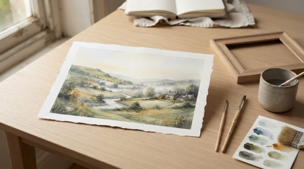
What if the quietest details in a landscape are the ones that stay with you longest? A pale wash of morning light, a softened hill in the distance or a few carefully placed marks can give watercolor landscape paintings their distinctive sense of air and place. You may already be drawn to their gentle atmosphere, yet feel unsure how an artist creates it or what to look for when choosing a painting.
You don’t need specialist knowledge to enjoy watercolour. A little understanding of transparent washes, edges, composition and light can help you see how a scene comes together and notice which details speak to you. This guide explores the visual character of watercolour landscapes, how artists suggest depth and atmosphere, and what to consider when comparing an original painting with a print. Take your time, follow what catches your eye, and choose a work that feels at home in your space.
Key Takeaways
- Learn what gives watercolour landscape paintings their distinctive feeling of light, openness and atmosphere.
- See how artists move from broad washes to selected details, while recognising that every painting follows its own path.
- Use a simple way of looking to notice a painting’s overall effect before focusing on individual details.
- Compare mood, colour, subject and scale to find artwork that feels right in your home.
- Explore how your own response can guide you when considering original paintings and limited edition prints.
What makes watercolour landscape paintings so distinctive?
A watercolour landscape painting depicts a natural or built view using water-based, transparent colour. Its character often comes from the way light paper shows through the paint, colours overlap without fully hiding one another, and some edges remain soft whilst others are carefully defined. The result can feel open and luminous, with enough detail to make a place recognisable.
A watercolour landscape painting is a view of a place made with transparent colour, where the paper, washes and selected details work together to suggest light, depth and atmosphere. That describes the medium, not a particular look. A watercolour can be delicate or bold, loose or precise.
A landscape subject alone doesn’t make a painting watercolour. The same hillside or harbour could be painted in oil, acrylic or another medium. Look instead at how the colour behaves: a thin watercolour wash may let the paper’s texture and lighter layers remain visible. For a wider overview of its development and techniques, see History and characteristics of watercolor painting.
How does watercolour create a sense of light?
Artists can leave selected areas of paper unpainted, allowing its light surface to act as a highlight. This might suggest a glint on water, a break in the clouds or a sunlit wall. Rather than adding white paint over a dark passage, the artist can plan around these lighter spaces from the start. Their shape and placement help guide your eye through the scene.
Transparent layers add colour without completely covering what lies beneath. Imagine a pale sky beside a darker hillside: a light blue wash can leave the paper’s brightness visible, while a deeper layer on the slope adds contrast. Where washes overlap, their combined colour can suggest changing light and distance while still allowing earlier marks to show through.
Why do watercolour landscapes feel atmospheric?
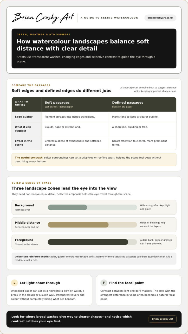
Soft edges can make a distant hill seem veiled by mist or a cloud appear to drift across the sky. Sharper edges tend to draw attention, so an artist can set a crisp tree or roofline against softer surroundings to suggest depth. This contrast gives a scene a sense of changing weather without describing every feature.
Water and pigment interact as the artist works, but the effects aren’t simply accidental. The amount of water, the timing of a mark and the condition of the paper all influence whether an edge spreads or stays defined. Artists can use that response deliberately, choosing softer passages for haze and more controlled marks for important shapes.
Restraint matters, too. A few strokes might indicate grasses along a bank, leaving the viewer to imagine their movement or the details beyond them. In watercolour landscapes, that balance between what’s shown and what’s left open can make a scene feel quietly alive.
How artists build depth, weather and atmosphere in watercolour landscapes
A finished landscape can look effortless, but its sense of space often comes from a series of considered choices. An artist might begin with broad areas of colour, then establish the main shapes and reserve fine marks for the end. This is one way to understand how a painting develops, not a fixed recipe. Some artists work more freely, return to earlier passages or leave areas deliberately unfinished.
Transparent layers give a watercolour landscape depth by letting colour and shape build gradually, so distant forms can stay light whilst nearer details gain weight and clarity. The aim isn’t to paint every feature. It’s to decide what helps the viewer feel the distance, weather and character of a place.
What do washes and layers contribute?
A wash is a passage of diluted colour, which can be smooth and even or varied in tone and texture. Broad washes may establish the sky, land or water before smaller areas are added. As transparent layers sit over one another, colour deepens and forms become clearer without every earlier mark disappearing.
Artists can also change the quality of an edge. In a wet-on-wet passage, pigment meets damp paper and spreads into soft transitions, useful for clouds, haze or distant land. Paint applied to dry paper tends to keep a more defined edge, which can help describe a shoreline, building or tree. A landscape may use both, shifting from softened distance to a clearer foreground.
How do composition and colour suggest a place?
It can help to think of a landscape in three broad zones: foreground, middle distance and background. A dark bank, path or group of grasses in front can frame the view. Beyond it, fields or buildings occupy the middle distance, while hills or sky form the farthest layer. These zones don’t need equal detail; selective emphasis helps the eye travel through the scene.
Colour relationships can reinforce that sense of space. Cooler, quieter colours may make distant forms appear to recede, whilst warmer or more saturated passages can draw attention closer. This is a tendency, not a rule: weather, light and the artist’s choices all affect how colours read. Contrast between light and dark matters too. The area with the strongest difference in value often becomes a natural focal point.
Imagine a view with a pale sky, a mid-toned hillside and a darker track leading towards a small cluster of trees. The hillside separates sky from foreground, while the track gives the eye a route into the scene. A few sharper marks around the trees could make them stand out; softer edges elsewhere would keep the wider view calm. This is one way watercolour landscape paintings balance structure with atmosphere.
As you look, notice where broad washes give way to clearer shapes and which contrast catches your eye first. To see how these choices appear in finished artwork, browse original paintings and limited edition prints.
How to look closely at a watercolour landscape painting
You don’t need to know technical terms to spend time with a painting. Begin by taking in the whole image, then let your attention move gradually towards its smaller choices. This simple sequence gives you a way to describe what you see, rather than trying to decide whether a painting is “good” according to someone else’s rules.
- Notice your first impression. What feeling or memory comes to mind? Is the scene calm, brisk, bright or still? There’s no right response; your first reaction is simply a useful starting point.
- Follow the composition. Where does your eye travel first, and where does it go next? Notice how the placement of a shoreline, path, building or stretch of sky shapes that journey through the image.
- Look at the light. Which areas seem brightest? Notice how those lighter passages sit beside darker shapes, and whether they draw your attention to a particular part of the view.
- Take in the colour. Are the colours close to what you might see outdoors, or has the artist chosen a more expressive palette? Consider how the relationships between colours affect the mood.
- Explore the details. Now look closely at marks and edges. Notice where forms appear crisp, where they blend softly, and how much the artist has chosen to describe.
Pause between steps. A painting can offer more when you return to the whole image after noticing one small area. This is especially useful with watercolour landscapes, where a tiny detail may make sense because of its place within a larger wash of colour, open sky or sweep of land.
Which details should you notice first?
Ask what first caught your eye: a bright opening in the clouds, a dark line of trees or a small building. Then look at the balance between open areas and defined forms. Expanses of sky or water can give the scene breathing room, whilst a few firmer shapes provide structure. Compare the edges, too. Soft transitions may make parts of the view feel distant, while a crisp detail can hold your attention. Neither quality is automatically better; consider what each contributes.
How can you recognise atmosphere and a sense of place?
Rather than judging the sky, land and water separately, notice how they connect. Does the colour of the sky seem reflected in a river, or does the land lead your eye towards the horizon? Light and colour can suggest a particular moment, such as a bright, clear morning or a grey, unsettled afternoon. Selective details may make a scene feel observed: a distinct bend in a path, an unusual roofline or a particular arrangement of trees.
There’s no single amount of detail or style that makes every landscape successful. Some paintings invite you in through recognisable forms; others leave more to the imagination. Try putting your response into words: “I like how the open sky makes the view feel spacious” is more useful than deciding that a painting is simply right or wrong. Your own attention is a good guide.
Choosing a watercolour landscape painting for your home
A painting becomes part of the room around it, so choosing one is about more than matching colours. Start with the feeling you’d like it to bring: perhaps a quiet view for a restful corner or a lively scene that gives a room energy. Then consider how its subject, palette and scale will sit alongside the furnishings already there.
What should you consider before choosing a landscape?
Use this comparison to identify what draws you in. It isn’t a checklist with right or wrong answers. A painting can complement a room without matching every cushion or wall colour, and an unexpected contrast may be what makes it feel at home.
| Consider | Ask yourself |
|---|---|
| Mood | Would I like this view to feel calm, open, dramatic or full of movement? |
| Palette | Which colours stand out? Do they echo or gently contrast with the room’s existing colours? |
| Subject | Am I drawn to a familiar landscape, a recognisable building or a more expressive scene? |
| Style | Do I prefer flowing washes, clearly described forms or a composition with generous open space? |
| Scale | Does the artwork feel balanced on its wall, and can I see its details from where I’ll usually sit or stand? |
Scale changes the way a painting speaks. Fine marks may reward close viewing, while broad shapes and open compositions can read clearly from across a room. If possible, view the artwork in the room where it will hang. Consider how it looks in natural daylight and in the softer light you use in the evening; colours and mood can shift as the light changes.
For broader buying guidance as you weigh up your options, explore this guide to original paintings in the UK.
How do originals and prints differ as choices?
An original painting is an individual artwork, with the artist’s marks and decisions made in that particular piece. A print reproduces an image, offering another way to enjoy the composition. Neither choice is automatically more suitable. Your preference may depend on whether you’re drawn to the presence of an original, the image itself, how it will be displayed or what you hope to collect.
For a closer look at print options, see the guide to limited edition fine art prints. You can also explore original paintings and limited edition prints and consider which works you’d enjoy living with day after day.
Explore watercolour landscapes through Brian Crosby Art
Learning to look closely can make choosing and enjoying a painting feel more personal. Rather than searching for a single “right” style, notice what holds your attention: the way a view catches the light, the character of a place or the feeling a particular arrangement of colour brings to mind. Your response is part of the experience, whether you’re browsing artwork, building your understanding or simply spending time with a landscape.
What can an artist and teacher’s perspective add?
Brian Crosby is a qualified art teacher and a recognised member of the Society of Architectural Illustrators. His experience as an artist and educator offers a helpful way into visual ideas that can seem unfamiliar at first. Looking at how a painting guides the eye, balances open space with defined shapes and gives a scene its sense of place doesn’t require specialist vocabulary. Start with what you notice, then consider how the image creates that impression.
That patient approach can be useful whether you’re exploring watercolour landscapes or learning to make art yourself. Brian teaches beginners and improvers, helping people develop their understanding and skills. Looking closely at a finished painting can prompt useful questions: what makes the scene feel inviting, which part draws your attention, and what details give the view its character? You don’t need technical terms before forming your own impression.
Where can readers continue exploring artwork?
Brian Crosby Art offers original paintings and limited edition prints as different ways to explore artwork. Take your time with each piece. Notice which images you return to, what feelings or memories they bring up, and whether you enjoy a work’s subject as much as its visual character. The same thoughtful looking you’ve practised throughout this guide can help you recognise what feels meaningful to you.
Original paintings and prints offer different ways to enjoy an image, but the choice needn’t be guided by jargon or someone else’s idea of what matters. You might value the individuality of an original or find that a print’s image and presentation suit you. What matters is how the artwork speaks to you and whether you can imagine enjoying it over time.
Explore Brian Crosby Art to browse the artwork and see which pieces catch your eye. Let the details inform you, but trust your own response: the right landscape is the one you’re glad to look at again.
Let your eye lead you to a landscape you’ll love
Choosing a painting doesn’t need to be a quick decision. Give yourself room to notice which views you return to and how they make you feel in the everyday rhythm of your home. A landscape that first catches your eye may reveal something new on a second look: a quiet detail, a remembered place or a quality of light you hadn’t noticed before.
That continuing relationship is part of the pleasure of living with art. The best choice for you isn’t necessarily the most detailed or dramatic. It’s the work that keeps inviting you to pause. Let what you’ve learnt about watercolour landscapes guide your looking, but leave space for instinct, too.
When you’re ready to find a landscape you’ll enjoy living with, browse Brian Crosby Art’s original paintings and limited edition prints. Follow your curiosity, trust your response and take time to choose the view that feels like yours.
Frequently Asked Questions
What paper is best for watercolour landscape painting?
For watercolour landscape painting, 300gsm cold-pressed watercolour paper is a dependable starting point. Its textured surface can hold several washes better than ordinary printer or sketchbook paper, which may buckle when wet. Cold-pressed paper has a slight tooth that suits varied landscape marks, from broad skies to textured ground. If you’re practising, try a small study on watercolour paper before committing to a larger sheet.
Can beginners paint watercolour landscapes?
Yes. Beginners can paint watercolour landscapes by starting with a simple view and a limited set of shapes. Try painting a sky, a distant line of hills and a foreground in separate areas before adding details. This keeps the first attempt manageable and helps you see how each part relates to the next. A small sketch beforehand can help you decide where the horizon sits and which areas to leave light.
How do you stop colours looking muddy in a watercolour landscape?
To keep colours clear, use clean water and rinse your brush between colour changes. Mixing too many pigments together can dull a colour, so test combinations on scrap watercolour paper before adding them to the painting. Let a passage dry before placing a new wash over it if you want the colours to stay distinct. If a section starts to look muddy, pause rather than repeatedly brushing over it.
Do watercolour landscape paintings fade over time?
They can fade, but how much depends partly on the pigments used and how the artwork is displayed. Prolonged exposure to strong daylight can affect colour, so avoid hanging a painting where direct sun falls on it for much of the day. Pigments vary in their resistance to fading, and the specific materials in a painting may not be known. Gentle, indirect light is a sensible choice for display.
Can a watercolour landscape painting be framed behind glass?
Yes, watercolour paintings are commonly framed behind glass. The glass helps shield the surface from dust and accidental contact, but the artwork should be mounted so it doesn’t touch the glass. A mount creates a visible space between the paper and glazing, while also giving the image room to breathe visually. Choose a frame that suits both the painting and its surroundings, and handle the artwork carefully during framing.
How can I tell an original watercolour landscape from a print?
An original is a one-off artwork, while a print reproduces an image. Look closely for physical marks and printed patterns, but don’t rely on appearance alone. Paper texture can show through in both, and a printed image may reproduce brushwork convincingly. Read the artwork description for its medium and whether it’s an original or limited edition print. A signature by itself isn’t conclusive, as artists may sign both originals and prints.