


The most striking rooms don’t just look expensive; they feel as though they have a story to tell. You’ve likely spent hours searching for architectural wall art prints that anchor your room, only to find yourself stuck between mass-produced posters that feel flimsy and original works that are far beyond the budget. It’s frustrating when you want your home or office to reflect your appreciation for structure and history, but the options often feel thin and lacking in character.
Selecting the right art is about more than just filling a gap on a wall. It’s about capturing the quiet soul of a building and the way light plays across stone and glass. In this guide, I’ll help you navigate the difference between a standard print and a high-quality limited edition that holds its value and its beauty. You’ll discover how to organise a curated look for your space, gain confidence in your framing choices, and learn why a structured, atmospheric print is the secret to a truly professional interior.
Key Takeaways
- Understand how architectural art brings a sense of history and perspective to your home through the clever use of light and structure.
- Explore the unique charm of different mediums, from detailed pen and ink illustrations to the soft, atmospheric tones of watercolours.
- Learn to identify high-quality architectural wall art prints by understanding the value of limited edition runs and professional Giclée printing.
- Master the art of styling with guidance on choosing between a single, bold statement piece or a thoughtfully organised gallery wall.
- Discover how a professional illustrator’s touch can capture the true character of a building, turning a simple wall into a conversation piece.
Why Architectural Wall Art Prints Are a Timeless Choice for Interiors
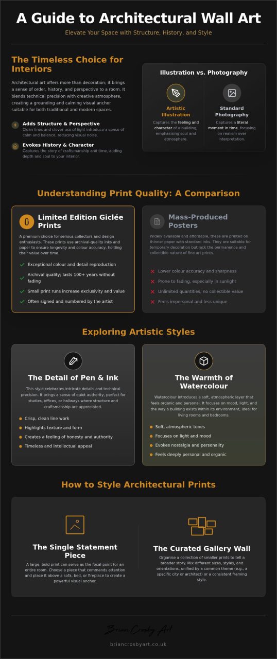
Choosing art for your home is a deeply personal journey. Whilst many people gravitate towards landscapes or abstracts, architectural wall art prints offer something uniquely grounding. These pieces aren’t merely records of bricks and mortar. Instead, they represent a careful study of structure, perspective, and the way light dances across a facade. They capture the weight of history and the ambition of design in a single frame. Architectural art is the intersection of technical precision and creative atmosphere.
It’s this blend of the rigid and the romantic that makes the genre so enduring. We are naturally drawn to the sense of order that a well-composed building provides. Whether it’s the soaring arches of a Gothic cathedral or the crisp, minimalist lines of a modern glass pavilion, these prints provide a visual anchor. They remind us of our shared history and the enduring nature of the spaces we inhabit. The versatility of the genre is remarkable; it fits amongst traditional heritage decor just as easily as it sits within a sleek, contemporary apartment.
The Emotional Impact of Structural Art
The psychology of our living spaces is often overlooked. Clean, structured lines can bring a surprising sense of calm to a busy, cluttered room. By introducing a sense of symmetry and balance, these prints help to lower the visual noise of an interior. This makes them an excellent choice for home offices or study areas where focus is paramount. There is also a strong element of nostalgia involved. A print of a heritage building often tells a story of craftsmanship and time, evoking a feeling of permanence. It’s a way to bring the outside world in, but in a way that feels curated and intentional for a thoughtfully organised home.
Architectural Art vs. Photography
You might wonder why you should choose a print over a photograph. A camera captures a literal moment, but an artist’s hand-drawn interpretation captures a feeling. Through the lens of Architectural illustration, a creator can emphasise the character of a building by playing with shadows or simplifying complex details. An illustration allows for a level of soul that a lens sometimes misses. It also gives you more flexibility with your interior design. You can choose a medium, be it a detailed pen drawing or a soft watercolour, that complements your existing colour palette perfectly. This artistic approach ensures your architectural wall art prints feel like a seamless part of your home’s personality.
Exploring Styles: From Hand-Drawn Illustrations to Atmospheric Watercolours
Most high-street shops offer generic architectural photography that can feel a bit cold or clinical. Whilst a photo captures a literal moment, the artist’s hand brings a layer of interpretation that changes how a room feels. When you begin looking for architectural wall art prints, you’ll quickly see how the medium itself dictates the mood. An ink drawing feels precise and intellectual, whereas a watercolour can feel breezy, nostalgic, and deeply personal.
The choice of medium is about more than just aesthetics; it’s about the “soul” of the piece. A structured drawing might highlight the clever engineering of a bridge, whilst a soft painting might focus on the way a cottage sits nestled in its garden. Understanding these styles helps you choose a piece that doesn’t just fill a gap on the wall but actually enhances the character of your home.
The Detail of Pen and Ink
There’s something deeply satisfying about the crispness of a pen stroke. Ink allows an artist to celebrate the intricate details of traditional craftsmanship that a camera lens often flattens. Think of the rough, tactile texture of weathered stone, the repetitive rhythm of Victorian brickwork, or the delicate grain in an ancient timber beam. These elements are pulled to the forefront through careful line work.
This style is perfect if you love the technical side of building. It’s an honest, clear approach to art that brings a sense of quiet authority to a study or a hallway. These same meticulous techniques are exactly what I use when creating commissioned house portraits UK clients often choose to celebrate their own homes. An ink print acts as a testament to the endurance of well-built structures, making it a timeless addition to any collection.
The Warmth of Architectural Watercolours
If pen and ink is about the “how” of a building, watercolour is about the “when”. This medium introduces a soft, atmospheric layer that feels much more organic in a domestic setting. By using delicate washes, an artist can evoke a specific time of day or the changing of the seasons. The golden glow of a late summer evening or the cool, muted light of a misty winter morning can transform a rigid structure into something that feels alive.
Watercolour prints are often the best choice for living rooms and bedrooms because they feel less clinical and more approachable. The way the pigments bleed into the paper mimics the natural variations of light and shadow, helping the art feel like a living part of your interior. It’s a wonderful way to bring a touch of the outdoors into your home. If you’re drawn to this same soft, atmospheric quality in natural scenery, you may also enjoy exploring landscape art prints Cheltenham collectors seek out for their ability to bring the British countryside indoors with the same emotional warmth. If you’re ready to find a piece that balances technical skill with a gentle, human touch, you can explore several atmospheric options in my limited edition print collection.
The Value of Limited Edition Prints vs. Mass-Produced Posters
When you’re searching for architectural wall art prints, the sheer volume of options can be overwhelming. On one hand, you have mass-produced posters printed in the thousands on thin, glossy paper. On the other, you have limited edition prints. A limited edition isn’t just a marketing term; it’s a promise of scarcity. Each piece is part of a restricted run, usually numbered and personally signed by the artist. This simple act transforms a piece of decor into a collectible asset that holds its character far longer than a standard poster ever could.
The difference in value comes down to how the work is produced. Mass-produced items are designed for high volume and low cost, which often leads to colours that shift or fade within just a few years. Choosing a limited run means you’re investing in a piece that bridges the gap between a simple wall covering and a gallery-standard work. It’s an accessible way to start an art collection without the immediate investment required for one-off pieces.
Understanding Print Quality and Longevity
The secret to a print that looks expensive lies in the technical details. High-quality architectural art is typically created using Giclée printing, a process that uses pigment-based, lightfast inks rather than standard dyes. These inks are designed to resist fading for decades, ensuring the atmospheric shadows and crisp lines of a building remain sharp. You can learn more about these standards in this guide to limited edition fine art prints.
The choice of paper is equally vital. Professional prints use heavy, acid-free paper that won’t yellow over time. For architectural drawings, the texture of the paper matters immensely; it needs enough “tooth” to mimic the original surface the artist used. This texture helps the eye perceive the depth in a sketch of a stone wall or the delicate wash of a watercolour sky. It’s these tactile details that distinguish a professional print from a flat, characterless poster.
The Exclusivity Factor
There’s a quiet pride in owning a piece that isn’t found in every high-street shop. Limited edition architectural wall art prints offer a sense of exclusivity that makes your home or office feel unique. For many collectors, these prints serve as the perfect middle ground. They provide the professional touch of a curated gallery whilst being more attainable than original paintings for sale UK wide.
Buyers often favour architectural prints created by recognised professionals, such as members of the Society of Architectural Illustrators. This membership acts as a hallmark of quality, ensuring the perspective and structural details are technically accurate. When you buy a signed, limited piece from a specialist, you aren’t just buying paper and ink; you’re buying the expertise and the “soul” that the artist poured into the original work.
How to Style Architectural Prints in Your Home and Office
Styling architectural wall art prints is an exercise in balance. Because these pieces are inherently structured and linear, they have a unique ability to define the character of a room. However, the key to a successful interior is ensuring the art feels integrated rather than isolated. Whether you are decorating a quiet corner of your home or a busy professional office, the way you present a piece is just as important as the artwork itself.
Choosing the right size is your first step. A large, single statement piece works beautifully above a sofa or a sideboard, acting as a primary focal point that draws the eye. Conversely, a series of smaller, related prints can be organised into a gallery wall. This approach is perfect for hallways or staircases, where you can tell a broader story of architectural history or personal travel. To keep the space from feeling too clinical, try balancing the straight lines of the buildings with softer textures. Placing a structured print near a leafy houseplant or above a chair with plush cushions creates a pleasing contrast between man-made precision and organic warmth.
In a professional setting, architectural art is particularly effective. It projects an image of order, reliability, and attention to detail. A well-placed structural drawing in a boardroom or behind a desk provides a sophisticated backdrop that feels both authoritative and creative. If you are looking for a piece that fits your specific dimensions, you can browse my latest collection of architectural prints to find the perfect match for your workspace.
Choosing the Right Frame
The frame acts as the bridge between the artwork and your wall. For architectural subjects, simple and clean frames usually work best. A thin black, oak, or dark wood frame allows the intricate details of the drawing to take centre stage without distraction. One of the most important elements is the mount, or mat. A wide mount provides essential “breathing space” around the print, preventing the composition from feeling cramped and giving it a more professional, gallery-quality finish. Whilst standard frames are often sufficient, bespoke framing is a wonderful investment for limited edition pieces, ensuring the materials used are fully archival.
Placement and Lighting
Where and how you hang your print can transform its impact. A common mistake is hanging art too high; aim for eye level, which is generally about 145cm to 150cm from the floor to the centre of the piece. Lighting also plays a vital role. Accent lighting, such as a dedicated picture light or a well-aimed spotlight, can highlight the atmospheric shadows and fine textures of a structural sketch. Just be careful to avoid hanging your prints in direct, harsh sunlight. Even with high-quality, lightfast inks, protecting your art from constant UV exposure is the best way to ensure its colours and character remain vibrant for decades to come.
Finding Your Perfect Piece: The Brian Crosby Art Collection
Finding a piece of art that truly resonates with your personal history is a rare and wonderful experience. My collection is built upon a deep appreciation for the structures that shape our lives. As a member of the Society of Architectural Illustrators, I focus on more than just technical accuracy. My goal is to capture the “soul” of a building, the way it sits within its environment, and the stories written into its walls. Whether you are drawn to the rugged charm of a stone cottage or the grand symmetry of a civic building, these architectural wall art prints are designed to bring a sense of permanence and tranquility to your home.
Every piece in the collection reflects a dedication to the character of British architecture. I spend time observing how light changes the mood of a facade, ensuring that each print carries an atmospheric weight that a standard photograph simply cannot replicate. By choosing from this curated selection, you aren’t just buying a decoration; you’re inviting a piece of craftsmanship into your space that celebrates the intersection of art and design. I encourage you to browse the gallery at your own pace and find the work that speaks to your own sense of place.
Bespoke Architectural Commissions
Sometimes, a print of a famous landmark isn’t quite enough to tell your specific story. If you’re looking for something deeply personal, I offer bespoke architectural commissions, often referred to as house portraits. This process involves turning your favourite building, perhaps a childhood home or the place where you were married, into a unique work of fine art. These commissions are a wonderful way to preserve a personal history, creating a hand-drawn heirloom that can be passed down through generations. They also make an incredibly thoughtful gift for those who take pride in their home and its heritage.
Quality Assurance and Framing Services
Quality is at the heart of everything I produce. I am committed to using only the finest archival materials, ensuring that every print you receive meets the high standards expected by collectors. This attention to detail extends beyond the paper and ink. I also provide creative framing services to help you achieve a professional, gallery-ready look that complements your interior perfectly. If you have existing architectural photos that have seen better days, my image restoration service can help preserve those memories before they fade away. I invite you to explore my online gallery for inspiration and to see how these pieces can transform your surroundings.
Transforming Your Walls with Character and Structure
Your home or office deserves art that reflects a genuine appreciation for craftsmanship and history. By choosing architectural wall art prints that focus on atmospheric light and structural detail, you create a space that feels both grounded and inspired. We’ve explored how opting for limited edition pieces ensures lasting quality, whilst thoughtful styling and professional framing help to anchor your decor with quiet confidence.
With over 20 years of artistic expertise and my standing as a member of the Society of Architectural Illustrators, I am dedicated to helping you find pieces that resonate with your personal story. Whether you’re looking for a specific landmark or require my highly-rated bespoke framing and restoration services, the goal is always to make fine art feel accessible and personal. I invite you to explore the limited edition architectural print collection today and discover a piece that brings tranquility and character to your daily life. It’s a wonderful way to begin your own collection with confidence.
Frequently Asked Questions
What is the best size for an architectural wall art print?
The best size for an architectural wall art print depends entirely on its intended location and the impact you want to create. For a chimney breast or above a large sofa, a single statement piece roughly 80x120cm creates a professional focal point. In smaller spaces or hallways, a series of A4 or A3 prints works better when organised into a gallery wall. Always measure your wall space first to ensure the art feels balanced amongst your furniture.
How do I know if an architectural print is high quality?
You can identify high-quality architectural wall art prints by looking for specific technical hallmarks. Professional artists use Giclée printing with pigment-based, lightfast inks that resist fading for decades. The paper should be heavy, acid-free, and archival to prevent yellowing. Check if the piece is a limited edition, as these are typically numbered and signed by the artist. This signature acts as a guarantee that the work meets the creator’s professional standards for detail and colour.
Should I choose a black and white or colour architectural print?
Your choice between black and white or colour should depend on the mood of your room. Monochrome prints, often created in pen and ink, highlight the technical precision and structural bones of a building, making them ideal for modern or minimalist interiors. Atmospheric watercolours, however, introduce a soft, organic warmth that suits living rooms and bedrooms. These coloured pieces use light and shadow to evoke a specific time of day, helping the art feel more integrated into a domestic setting.
What is the difference between a poster and a fine art architectural print?
The main difference lies in the materials and the exclusivity of the run. Mass-produced posters are printed in the thousands on thin, glossy paper using standard dyes that fade quickly in sunlight. In contrast, a fine art architectural print is part of a restricted, limited edition run. These are produced on heavy, textured paper using professional-grade inks. Whilst a poster depreciates immediately, a signed fine art print holds its character and value as a genuine collectible piece.
Can architectural prints work in a small room?
Architectural prints are actually perfect for small rooms because the use of perspective can create an illusion of depth. A detailed drawing of a colonnade or a receding street scene can make a wall feel as though it’s opening up. To keep the space from feeling overwhelmed, choose smaller, highly detailed prints rather than one massive statement piece. This encourages viewers to step closer and engage with the intricate textures of the stone and brickwork.
How do I clean and maintain my framed architectural prints?
Maintaining your framed prints is straightforward if you follow a few archival rules. Use a dry, soft microfibre cloth to gently dust the frame and the glass; never spray cleaning chemicals directly onto the art. To prevent the paper from rippling or the colours from shifting, keep your prints away from damp areas and direct, harsh sunlight. If the glass becomes particularly dirty, apply a small amount of glass cleaner to a cloth first, then wipe carefully.
What kind of frame suits architectural drawings best?
Simple, understated frames usually suit architectural drawings best because they don’t distract from the intricate line work. Thin frames in black, dark wood, or natural oak provide a clean border that complements the structured nature of the subject. It is also vital to use a wide mount, or mat, which provides breathing space around the artwork. This professional touch prevents the drawing from feeling cramped and helps to draw the viewer’s eye towards the central composition.
[…] appeal that transcends passing trends. Whether it is a grand stately home or a charming cottage, architectural wall art prints add a sense of history and intellectual weight to a room. They are particularly well-suited for […]